
Author: Dr. Girisha Verma
The pharmaceutical industry is constantly striving to discover new drugs and develop new treatments. As R&D teams pursue potential candidates for further development, they are routinely encountered with the need to take a go or no-go decision about the efficacy of the candidate and its market viability. Data is evaluated by multiple stakeholders, and a consensus is reached whether to move forward or pause the journey, or to end it completely. Large volume of complex data has been generated by previous research posing a challenge for stakeholders to quickly interpret before actively contributing to decision-making.
This is where data visualization comes in. It cuts through the noisy data to reveal the most important connections, patterns, and trends.
How does data visualization help?
Data visualization is a technique that makes complicated information easy to assimilate and comprehend. Instead of relying on sophisticated scientific language in text format, data is presented as graphs, charts,images, and infographics to clearly and quickly communicate results, trends, and patterns. Explaining research visually helps all stakeholders and confident decisions and bring about improvements along the drug development journey.
Common uses include:
Target identification
The transformative impact of knowledge graphs on pharmaceutical companies lies in their ability to expedite the target identification process. This facilitates researchers in effectively navigating extensive datasets, streamlining the identification of potential targets, and consequently minimizing the time and resources needed for experimental validation.
Project Snapshots
Visualizations can be presented to stakeholders to quickly provide insights to roadblocks or successes, and real-time updates about the ongoing program.
Visual network maps
reveal connections between different nodes representing molecules, chemicals, mechanisms of action (MoA), diseases, treatment, and competitor products. Observing the visual density of nodes or strings can quickly identify potential treatment opportunities or market gaps.
Competitor analysis
can be supported by visualizations. IP and patents can be mapped alongside investments, marketing activities, and geographic reach.
Customer feedback
can also be presented visually. Companies can gain insight into how customers are using their products, supporting ongoing product development and market strategies. Visualizations can also help identify trends and develop customer behaviour.
Augmented reality
in the future, visualizations will take advantage of augmented reality (AR), mixed reality (MR), and virtual reality (VR) to further improve engagement, comprehension, and insight.
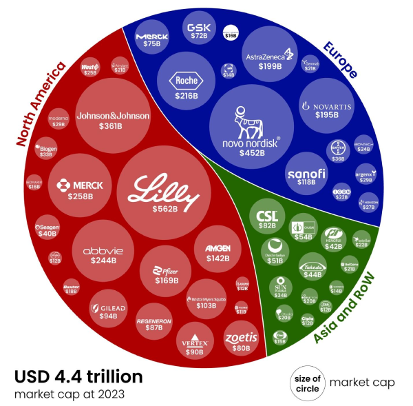
Figure 1: Top 50 Global pharma companies by their market capitalization (Proud that Exclera works with 20 of them)
Data source: https://companiesmarketcap.com/pharmaceuticals/largest-pharmaceutical-companies-by-market-cap/
This visualization shows the global pharmaceutical companies by market capitalization in 2023. It is a simple yet effective way to compare the performance of different pharmaceutical companies. The image is also visually appealing, with a clean and modern design.
Visualizations have become essential to the drug discovery and development process. They also play an important role in ongoing activities such as marketing, communications, and customer feedback. Of course, it’s crucial that visualizations in pharma must be tailored to the precise requirements of the drug development journey and the specific data. They must provide clarity and accuracy to engage with the audience. The audience are most often people tasked with critical decision making responsibilities. Pharmaceutical companies with effective visual communication strategies tend to make better decisions, engage wider audiences, and build trust and confidence amongst internal stakeholders and external customers alike.
This impactful visualization designed by Carrie Bennette highlights the number of participants in clinical trials for specific therapeutic areas, from 2010 to 2020. We can visually grasp in seconds that the blood related category has the highest number of clinical trial participants even though the number of drugs involved were low. Whereas for antineoplastic / immunomodulators huge number of drugs are under clinical trial for much smaller patient size.
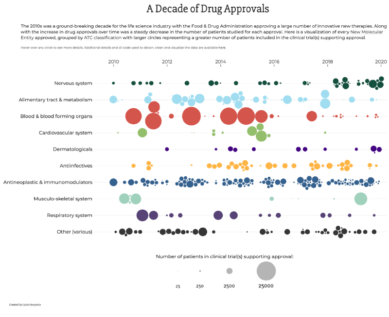
Figure 2: A Decade of Drug Approvals
Data source: http://carriebennette.com/fda-approvals-viz/
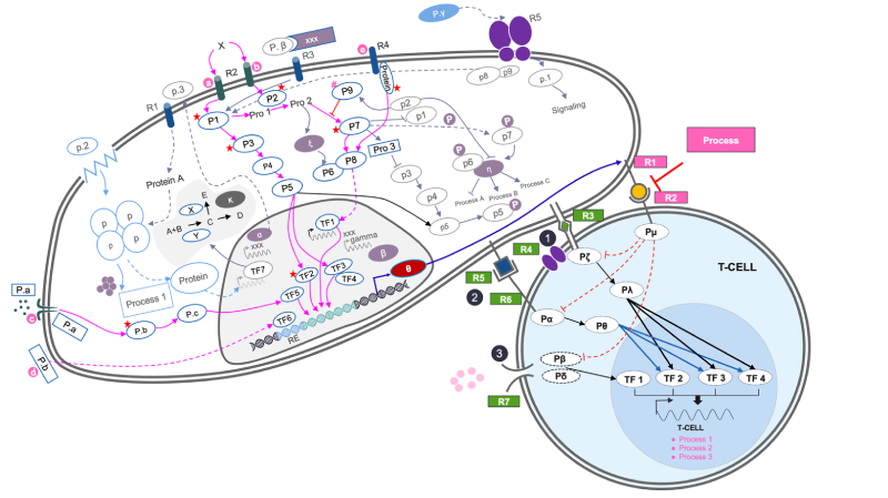
Figure 3: Pathway diagram for oncology drug x
Data source:Excelra The visual diagram shows pathways in a cell, nucleus, and T-cell communication using receptor, stimulatory, and mediated signals. The visual representation helps the scientist to easily understand the impact of the pathways in a drug’s mechanism of action and how it acts as a inhibitor or inducer.
Types of visualizations
Visualization is a broad term that encapsulates many forms of visual reporting and storytelling. Some people consider ancient star maps to be the first form of data visualization, but since then, the representation of quantitative data by William Playfair, Florence Nightingale, and Fritz Khan, amongst others, led to the most standard forms of data visualization and infographics currently used: bar charts, pie charts, and line graphs. Today, these kinds of charts are still used, but there are also many more advanced forms of visualization available, featuring greater interactivity, 3d spatial environments, and network maps that can be viewed from macro or micro perspectives.
Drug development R&D benefits from each of these types of visualization, and the specifics of their work are often best represented in a bespoke amalgamation of multiple visual approaches. Of course, it is never a good idea to ‘fit’ data into one pre-defined visual structure. Smart decisions must be made with their visualization supplier to ensure their data is represented most appropriately. This is why off-the-shelf visualizations are so often insufficient for pharmaceutical companies. Instead, visualizations must be provided by suppliers who fully understand the drug development process and the data involved to really make it valuable for the audience.
Points to consider when developing visualizations
To meet this demand, pharmaceutical companies rely on data visualization to help make information more accessible and easy to understand. Good visualizations help R&D teams communicate their findings to wider teams, but inadequate visualizations can be risky.
Visualizations shouldn’t just ‘look nice’. They need to work for you. They have to provide clear, concise, and accurate visual representations of data. However, the process of developing good data visualizations can be difficult and time-consuming.
First of all, the data to be visualized must all be structured and standardized so that it’s correctly collected by the visual model. So vendors in this space must understand the complexity and specifics of the data used and produced in drug development. They also need to understand what needs to be communicated. The lack of understanding of the science, modern technology and end-to-end drug discovery workflow can lead to visualizations that fail to provide the precise information required by decision-makers. If visualizations do not reflect the experience of the researchers or adequately communicate those experiences to stakeholders, they are an expensive distraction, wasting time in an already slow process.
What to look for in a visualization provider?
When looking for a visualization partner, pharmaceutical companies need to find a vendor with key competencies and experiences who can understand both the sides. The researcher as well as the audience.
- Expertise to handle biological, chemical, and clinical data.
- Experience working with the specific data-sets you need to represent.
- Do they have a fair mix of graphic designers, animators, data engineers and qualified life scientists?
- How will they integrate and deploy the visualizations into your project?
- Do they co-develop visualizations with you to ensure your objectives will be met? Do they provide generic, off-the-shelf solutions?
- Do they offer customized and ongoing development support with low-code/no-code options to help you continually adapt and optimize as your needs change in the future? Do they provide a one-off service or product?
Smart R&D-IT teams should ask these questions to any potential visualization partner. A provider that does not meet the criteria should be avoided.
Discover Excelra
Excelra is embedded in the life science community. We understand drug discovery and development. Our visualization team includes qualified scientists, designers, programmers, and data engineers. We’re confident that there is no better supplier of bioinformatic visualizations in the world. We have a wealth of experience and expertise in curating, standardizing, transferring, and managing biological, chemical, and clinical data. We integrate visualizations within your pre-existing infrastructure and pipelines. We can work with any cloud platform of your choice. Our solutions are custom-built to your precise requirements, utilizing core programs where available to save you time and money. We develop bespoke solutions to meet your exact objectives. Our interactive dashboards can be customized to display different data to different audiences as the need arises. We integrate low-code/no-code functionality as you require, so your teams can continually improve the visualization solution in your ongoing drug development activities.
Conclusion
Data visualizations are crucial in drug development, offering time and cost benefits by distilling core messages. They aid decision-making for pharmaceutical companies. However, exercise caution in visual communication. In-house development is expensive and time-consuming, while outsourcing also carries risks. To optimize visualization solutions, choose a partner familiar with data science, drug development, technology, and life science . Your team should comprise domain experts and visual designers, situated at the intersection of science and technology. Achieve visualizations that effectively communicate the ongoing research and development to diverse audiences.
That’s why you need more than just data. That’s why you need Excelra. Where data means more.